![]()
Hiromi Teashop
Combining the retail methods of ancient and modern eras and increasing the cohesion among the Ke family, Hiromi Store/Teashop is still prosperous.
Exquisite Tea in Changhua, Taiwan 裕美百貨
Hiromi Store is located on the hub road of Shengang township in Changhua City.
During the daytime, Hiromi Store, once the community center, sells everything regarding Florida water, spring couplets, umbrellas, cosmetics, clothing, schoolbags, uniforms, and etc. At night, Hiromi Store transforms to the language cram school, where the owner Mr. Ke teaches Japanese he learned during the Japanese occupation.
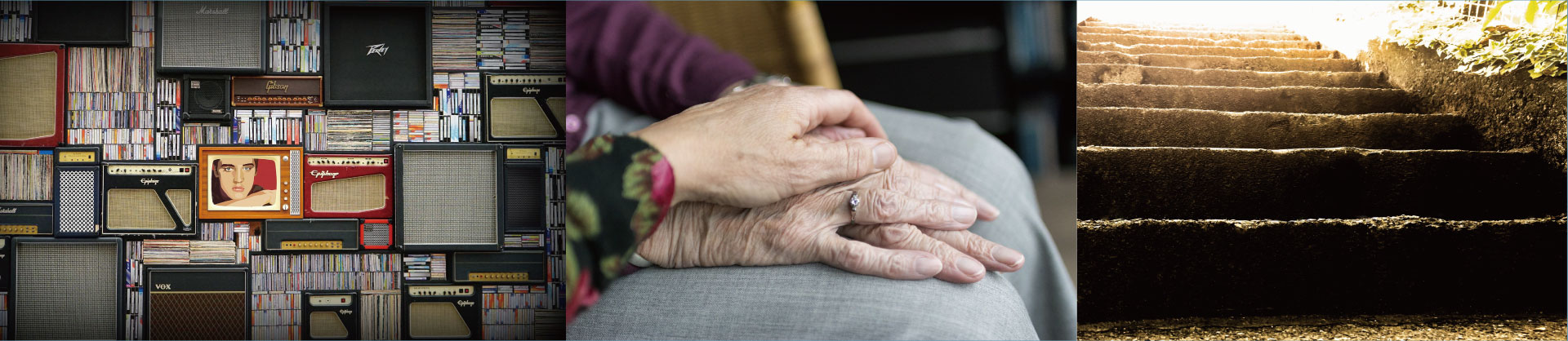
For more than fifty years, Hiromi Store has witnessed the decline of traditional retail industry and the rise of new department stores. Also, Hiromi Store watched members of the Ke family from infant, school student, soldiering, marriage, to the birth of the next generation.
In 2018, Hiromi Store went out of business after the owner, Mr. Ke passed away.
In 2022, Hiromi Store reopened. This time, it sells tea.
Combining the retail methods of ancient and modern eras and increasing the cohesion among the Ke family, Hiromi Store/Teashop is still prosperous.
裕美百貨,位於伸港市區的樞紐道路上。
白天的裕美百貨曾經是鄉鎮的生活中心,從明星花露水、春聯、雨傘、化妝品、男女服飾、到學生書包與制服,無一不賣 ; 夜裏,裕美百貨搖身變成柯老師日語教室,老闆柯桑教授他自日治時期習得的日語。
五十多年來,裕美百貨見證時代更迭、傳統零售業的凋零與新興百貨的崛起, 看一個個柯家孩子從襁褓、初中、當兵、娶妻,到下一代誕生。
二零一八年,隨著柯桑離世,裕美百貨拉下鐵門。 二零二二年,裕美百貨重新開張。這一次,裕美百貨賣茶飲。
結合古今流行的零售方式與集結柯家人的向心力,裕美百貨的名字與榮盛時代,還在進行式。
HIROMI:
1954 — present
Combining the retail methods of ancient and modern eras and increasing the cohesion among the Ke family, Hiromi Store is still prosperous.
Brand Concept
Retail Store
Ke Family
Memory
Logo Concept
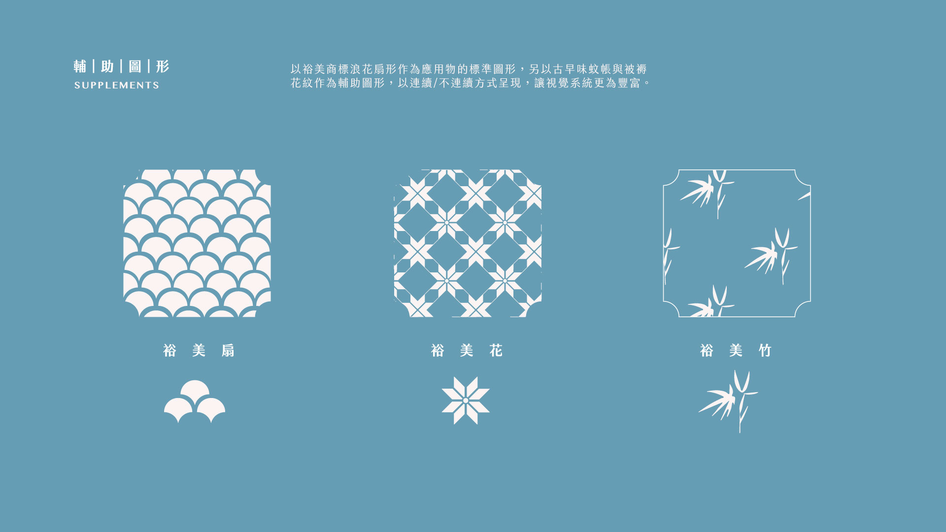
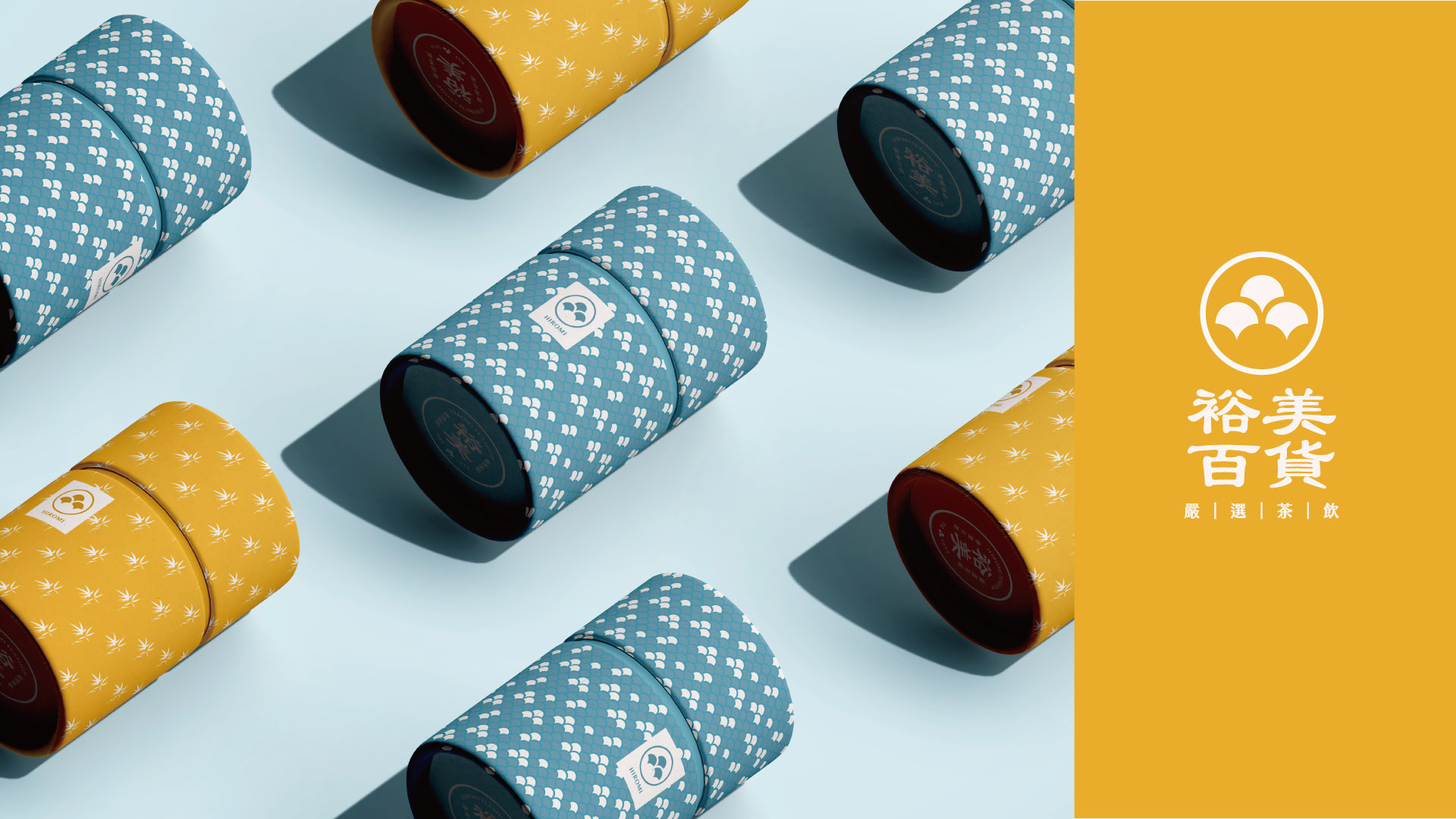
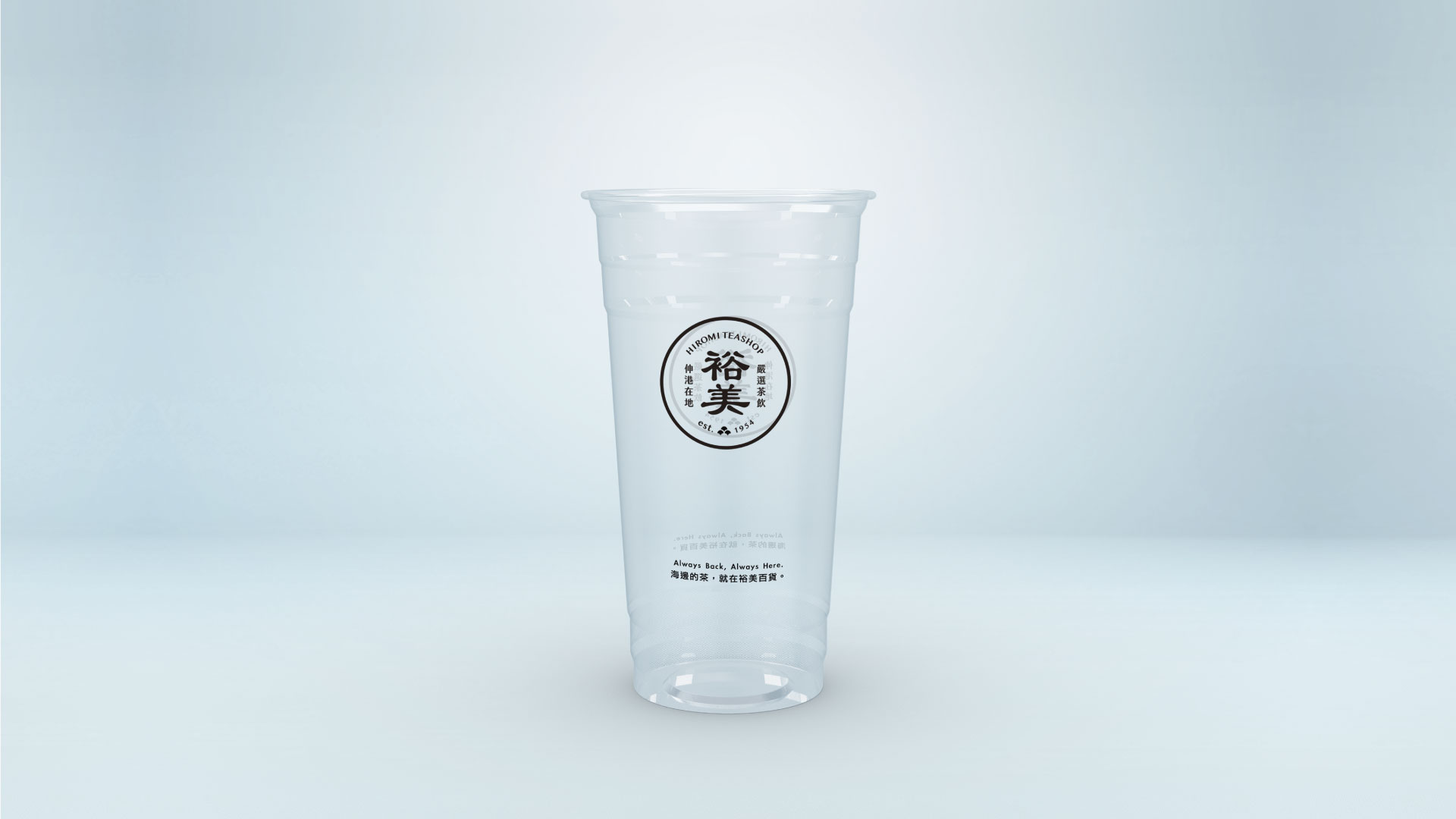
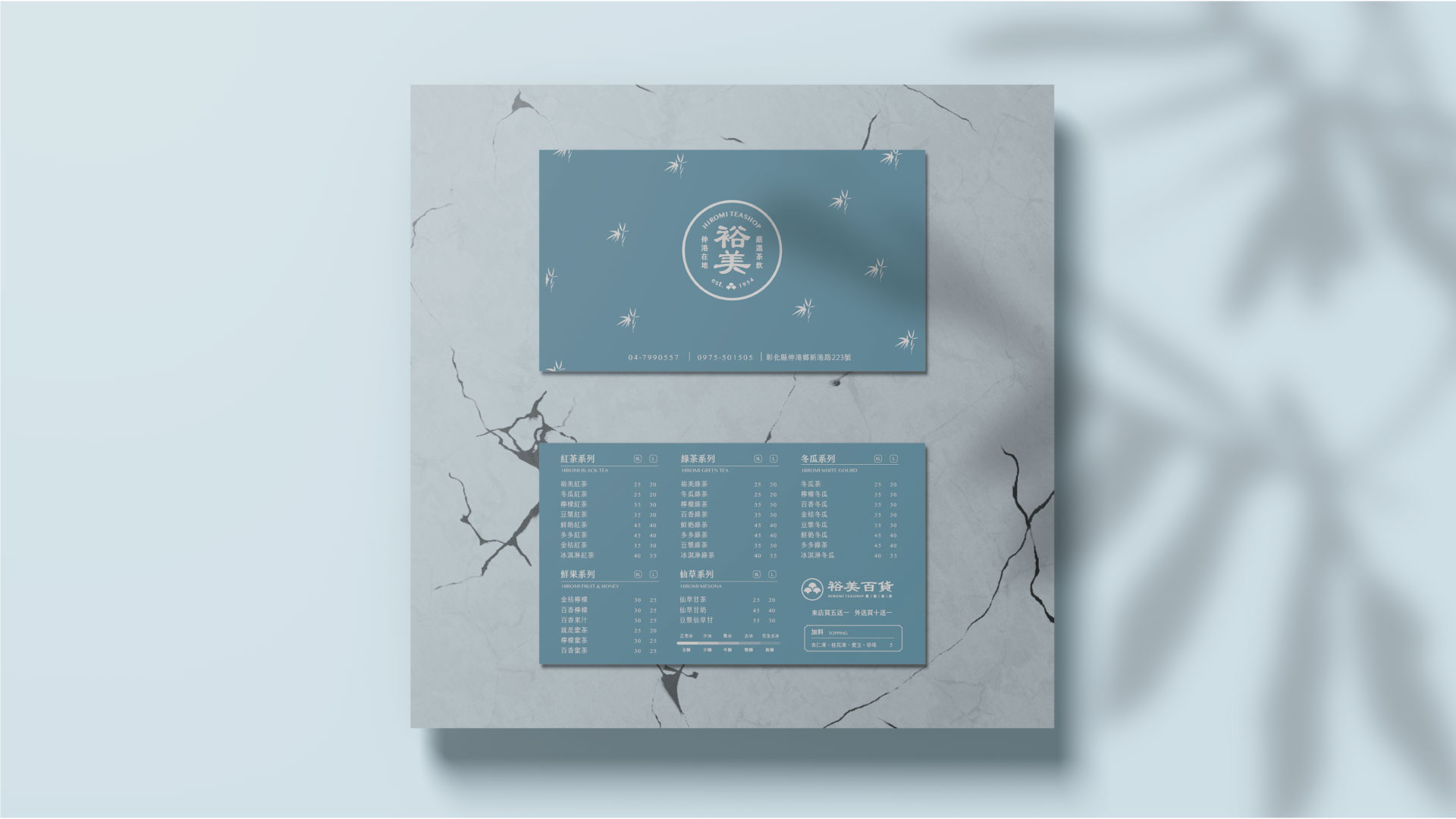
Starting from the word, 品, which includes the meaning of “tasting tea”, “goods”, and the “Ke,” Family name, the logo of Hiromi Store takes the form of a Japanese family emblem and Ke family’s memory as the content.
The surname, Ke, symbolizes a woodman with an axe who thrives on wood in the oracle bone)
從「品」字作為起點,涵蓋「品茶」、「貨品」,以及「柯姓」意涵(興木之人「刀斧」象徵),裕美百貨的識別圖像設計以日式家徽為形式,以柯氏記憶為內容。
Color Plan
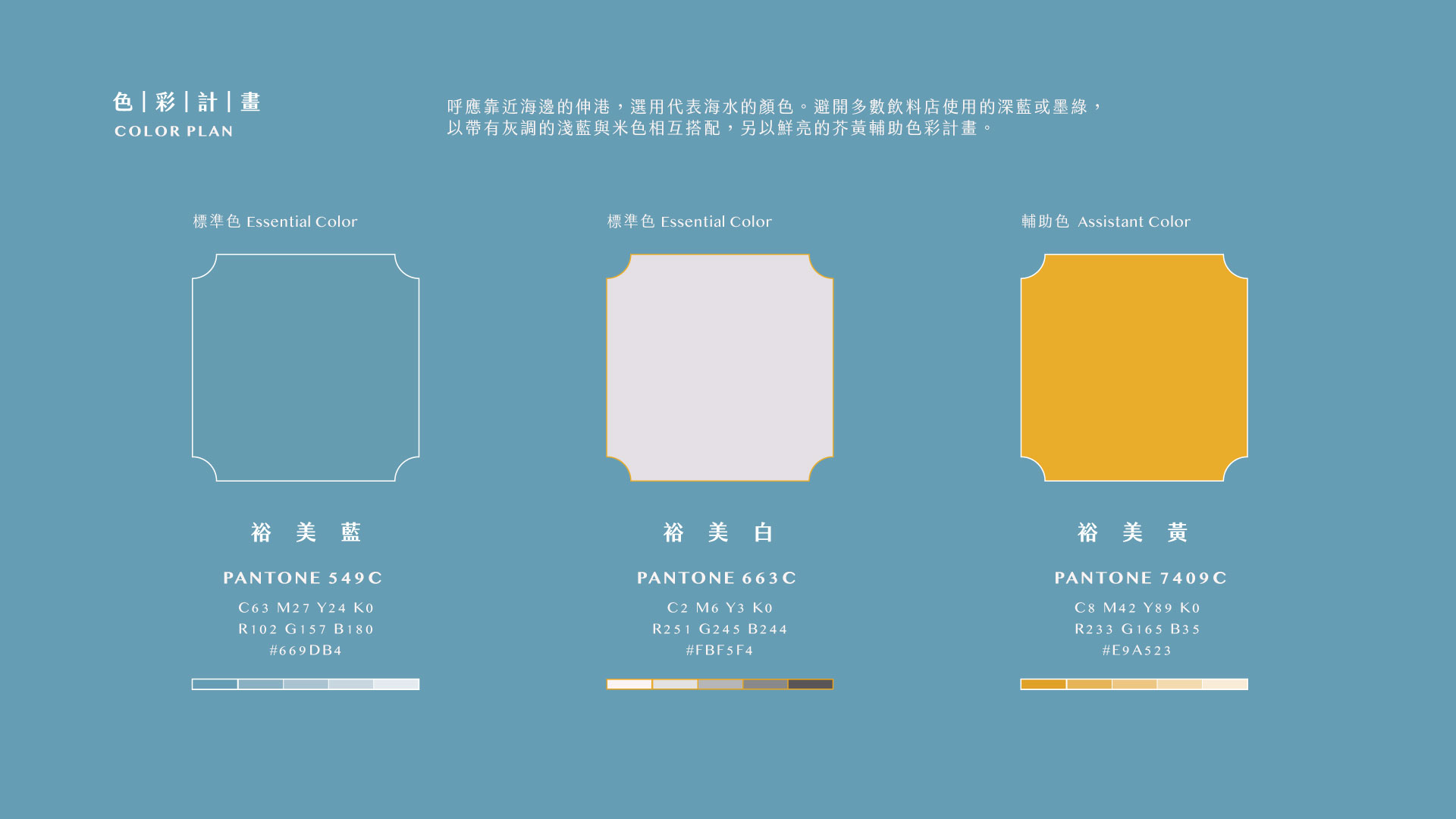
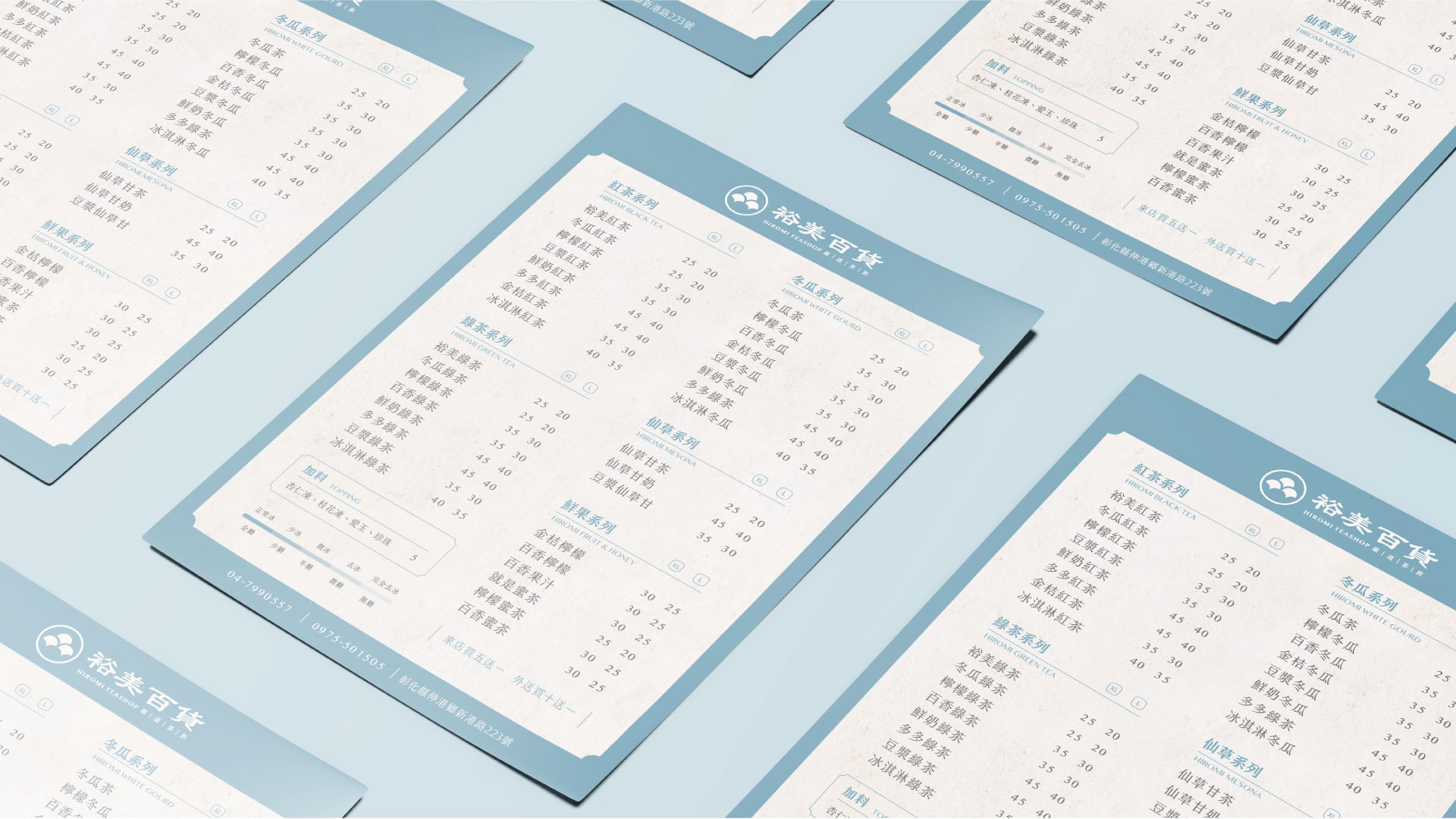
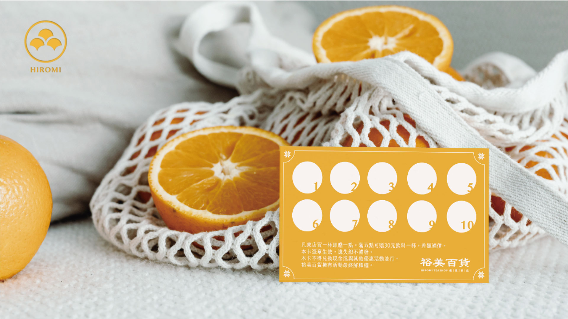
In response to Shenkang, which is close to the seaside, the standard color is chosen to represent the color of the sea water. Avoiding the dark blue or dark green used in most beverage shops, the logo of Hiromi Store uses light blue and beige with gray tones to match each other, and use bright mustard yellow to supplement the color plan.
呼應靠近海邊的伸港,標準色選用代表海水的顏色。避開多數飲料店使用的深藍或墨綠,以帶有灰調的淺藍與米色相互搭配,另以鮮亮的芥黃輔助色彩計畫。
Marketing Strategy | Echo Ke
Visual Design |Echo Ke
Client | Hiromi Teashop
Year | 2022