![]()
Before Trilogy Posters
#time #love #dialogue
愛在系列三部曲海報
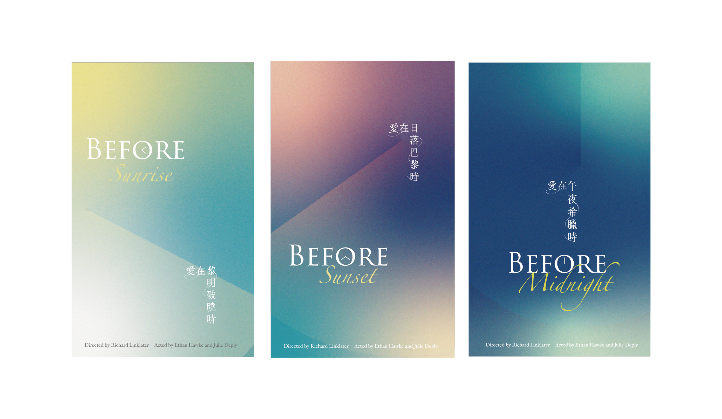
The movie “Before Sunrise” was released in 1995. Unlike typical films with dramatic plot developments, this film focuses entirely on the dialogue between the main characters. The scenes change as they walk through different paths. The content of their conversations is ordinary, but there is a subtle emotion in their eye contact, revealing their values as they engage in flowing conversations. The film received significant attention upon its release, and in 2004’s “Before Sunset” and 2014’s “Before Midnight,” the reunions and married life of the characters were respectively explored.
The “Before” trilogy films authentically depict the transition from the dreamy stages of ambiguity and romance to the practicalities of married life. However, due to the trilogy spanning over two decades, there are significant disparities in the proportions of characters on the posters, the use of fonts, layout, and design styles. The motivation behind this project is to ensure that the three posters achieve visual and conceptual consistency, allowing the “Before” trilogy posters to stand independently while also forming a cohesive visual theme when combined.
電影《愛在黎明破曉時》於1995年上映。該片與一般電影不同,沒有跌宕起伏的情節安排,整個故事一直集中在主角之間的對話上,場景隨著他們漫步的路線而變化。角色們交談的內容是平凡的日常對話,但在眼神交會中帶有一絲情感,各自的價值觀在對話中得到充分展現。這部電影一上映就引起了巨大的迴響,而在2004年的《愛在日落巴黎時》和2014年的《愛在午夜希臘時》中,分別描繪了主角們的重逢和婚後生活。
愛在系列三部曲電影真實地呈現了人們從曖昧與戀愛的夢幻狀態,到婚後現實的生活。然而,由於這三部電影跨越了二十多年,海報中的角色比例、使用的字體、排版和設計風格都有很大的差異。因此,這次專案的設計動機在於確保三張海報在視覺和概念上能夠達到一致性,使愛在三部曲的海報既能夠獨立存在,又能夠組合成一個主題明確的畫面。
1995
2004
2014
#time #love #dialogue
#pointer #magic hour #flow
Design Concept
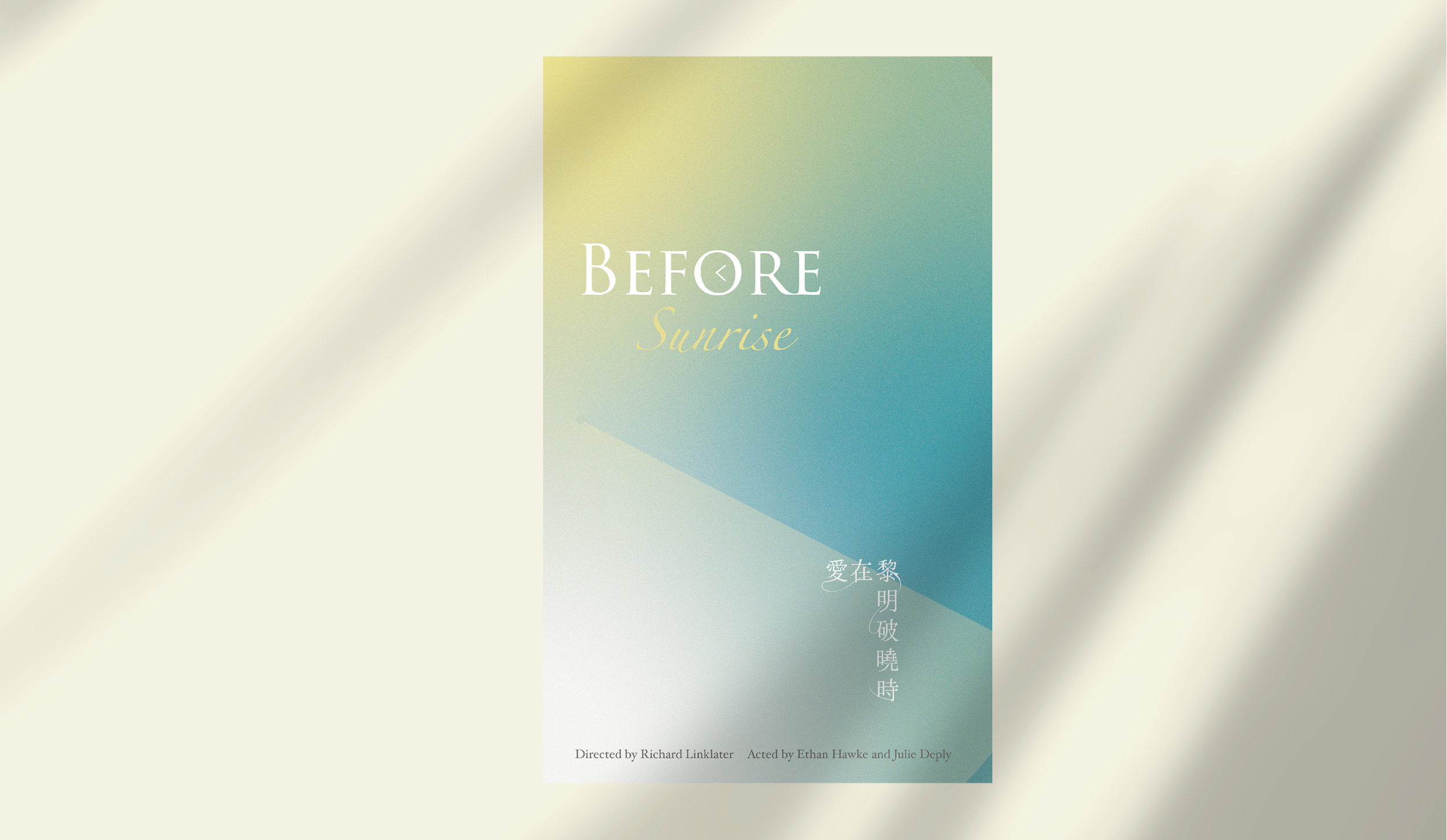
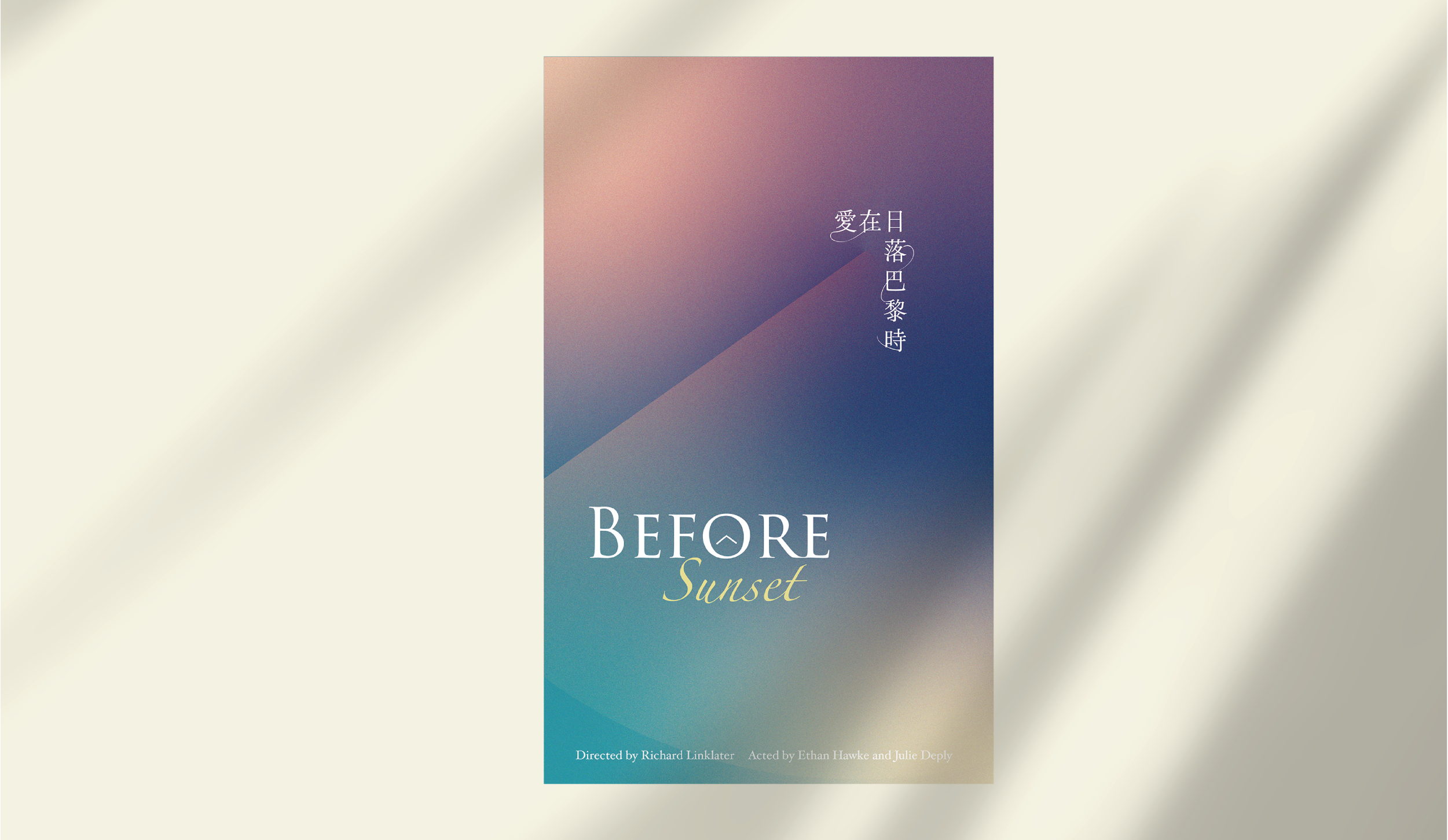
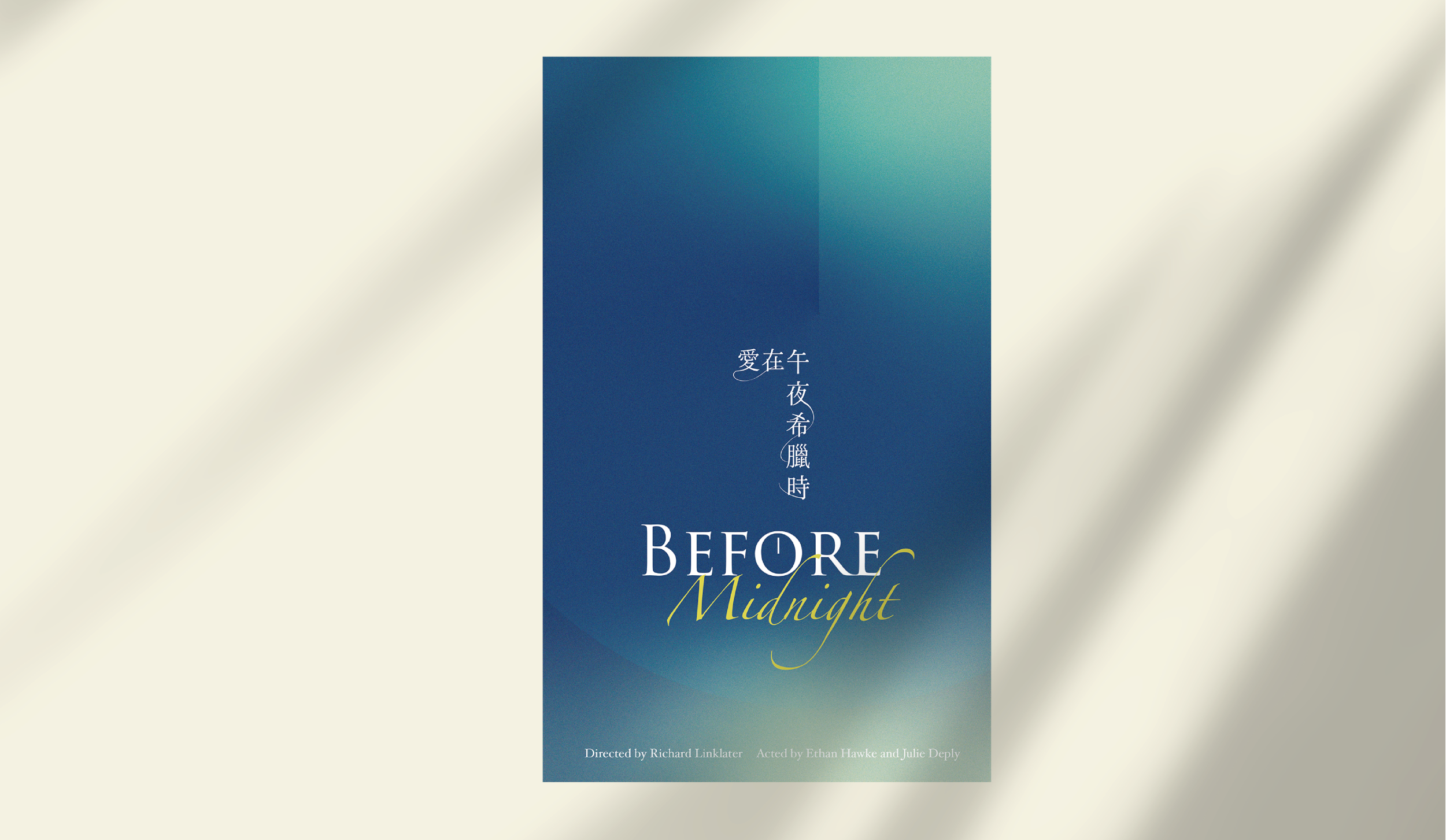
Based on the observation and conclusion above, we can design the poster layout following the golden ratio. The concept centers around time, romance, and dialogue, transformed into pointers, magical moments, and flow.
- Time > Pointers: Use pointers’ direction to indicate the time points of dawn, sunset, and midnight.
- Romance > Magical Moments: Present the state of romance as undefined elements, much like the undefined colors of the sky during dawn, sunset, and midnight. Soft gradients or blurry effects create a dreamy atmosphere.
- Dialogue > Flow: through streamlined patterns, illustrate the flow of ideas and emotions when characters interact, emphasizing the smoothness of the conversation.
Regarding font choices, English standard fonts conveys a sense of time and flow. For Chinese standard fonts, it emphasize the connections between characters, creating a sense of fluidity. The overall design goal is to visually communicate the passage of time, the dreaminess of romance, and the coherence of dialogue, creating a poster with depth and emotion.
根據以上的觀察和結論,我們可以設計海報的排版,以黃金比例為基礎。概念將以時間、戀愛、和對話為出發點,轉化成指針、魔幻時刻、和流動來呈現。
- 時間 > 指針: 使用指針的方向來表示黎明、日落、和午夜的時間點。
- **戀愛 > 魔幻時刻:**以柔和的漸變色彩或模糊的效果,呈現戀愛不明確狀態呈現為不明確的元素,就像黎明、日落、和午夜時天空的色彩無法明確定義一樣。創造一種夢幻的氛圍。
- **對話 > 流動:**透過流線型的圖案或符號, 表現兩人相處時,觀念與情感的流動。
至於字體的選擇,英文標準字可以選擇具有時間和流動感的字型,中文標準字則可以強調字與字之間的連結,形成一種流動感。整體設計的目標是在視覺上傳達時間的流逝、戀愛的夢幻、和對話的連貫,以創造一個具有深度和情感的海報。

Sunrise
Sunset
Midnight

Poster Concept | Echo Ke
Poster Visual Design | Echo Ke
Year | 2023