![]()
A Sha Zonzi
A symphony with the rice dumpling during Dragon Boat Festival 阿霞粽子
With the advancement of technology, people have decreased the dependency on paper gradually. Compared with paper calendars and books, modern people use calendar applications on mobile phones and desktops more.
With the decline of paper calendars and the slack seasons, especially Summer, in the printing industry, A-Sha’s family has been thinking about the flexibility and possibilities of work. And a surprising opportunity unfolded from Zongzi, also called rice dumpling.
Every May and June are a good time for every household to celebrate the Dragon Boat Festival and eat zonzi. A-Sha, who has excellent craftsmanship, will always make bunches of zonzi and give them to her neighbors. Due to the good reputation of this delicacy, A-Sha decided to start selling zonzi during the slack season of the printing industry, and this decision lasted for decades.
科技進步以後,人們對於紙本的依賴度逐年降低。相較於紙本日曆與書冊,現代人更普遍使用手機、電腦裡的日曆應用程式。
隨著紙本日曆的式微,以及因應印刷業淡季的出路,阿霞一家一直在思考工作的彈性與可能性。而一個誤打誤撞的機會從粽子展開。
每年五六月,是家家戶戶歡慶端午節、吃粽子的好時節。擁有優異手藝的阿霞,總會包上一串串粽子,送給街坊鄰居。而這份美味由於擁有好口碑,阿霞決定在印刷業的淡季開賣粽子,而這一投入便是數十載。
A Sha Zonzi
starting from a warm greeting
Logo Concept
Analyzing the zonzi merchants on the market based on modernity and old-school simplicity, zonzi shapes and non-zongzi shapes, there are few identifications on the market that clearly convey a sense of modernity, or fully express classicism and heritage.
Therefore, the identity style of this project is with a modern feel, trying to highlight the differentiation of the identity.
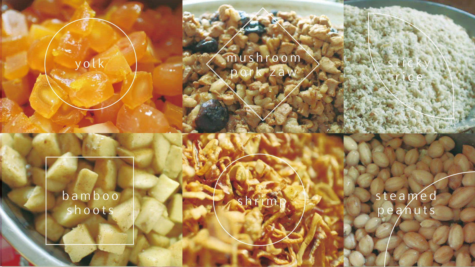
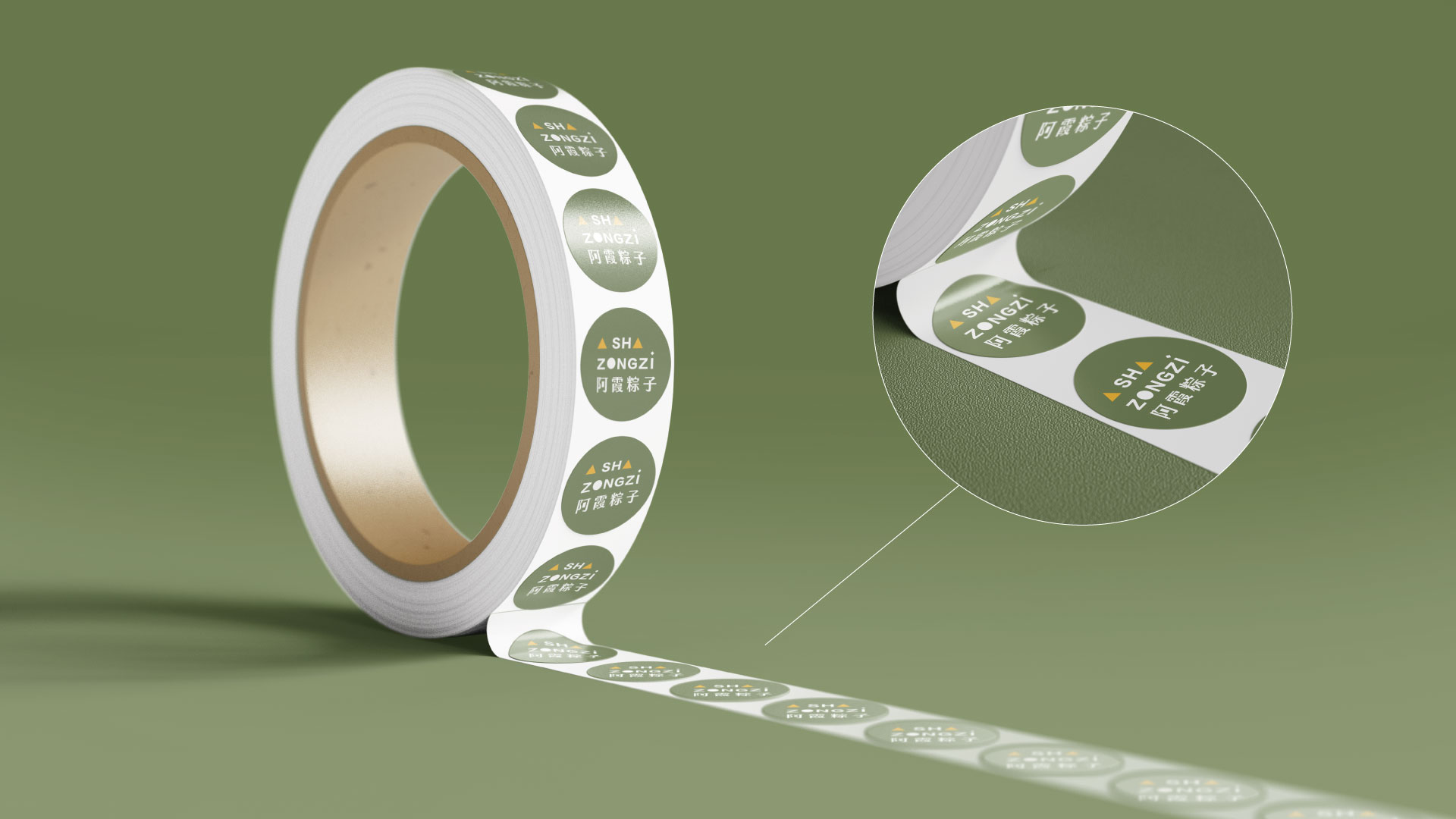
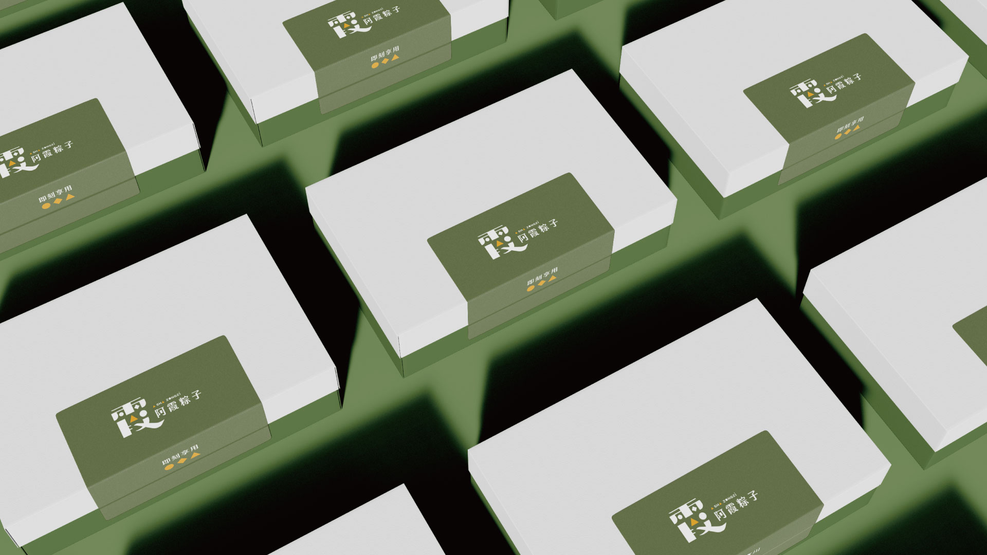
The identity elements are composed by the transformation from common materials of zonzi. The yolk, mushroom meat, glutinous rice, bamboo shoots, dried shrimps and steamed peanuts are transformed into the basic Geometric shapes – triangles, circles, squares.
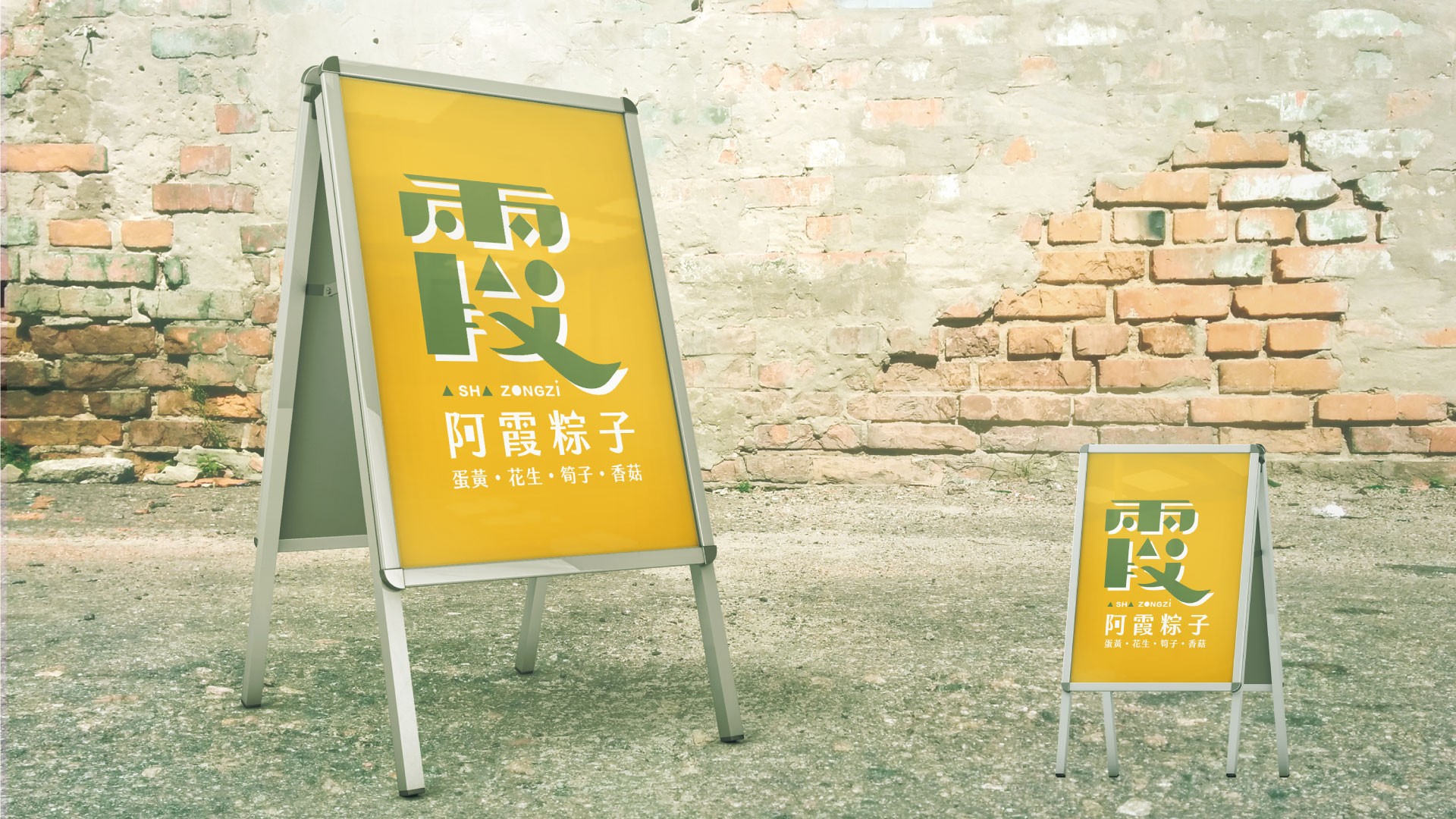
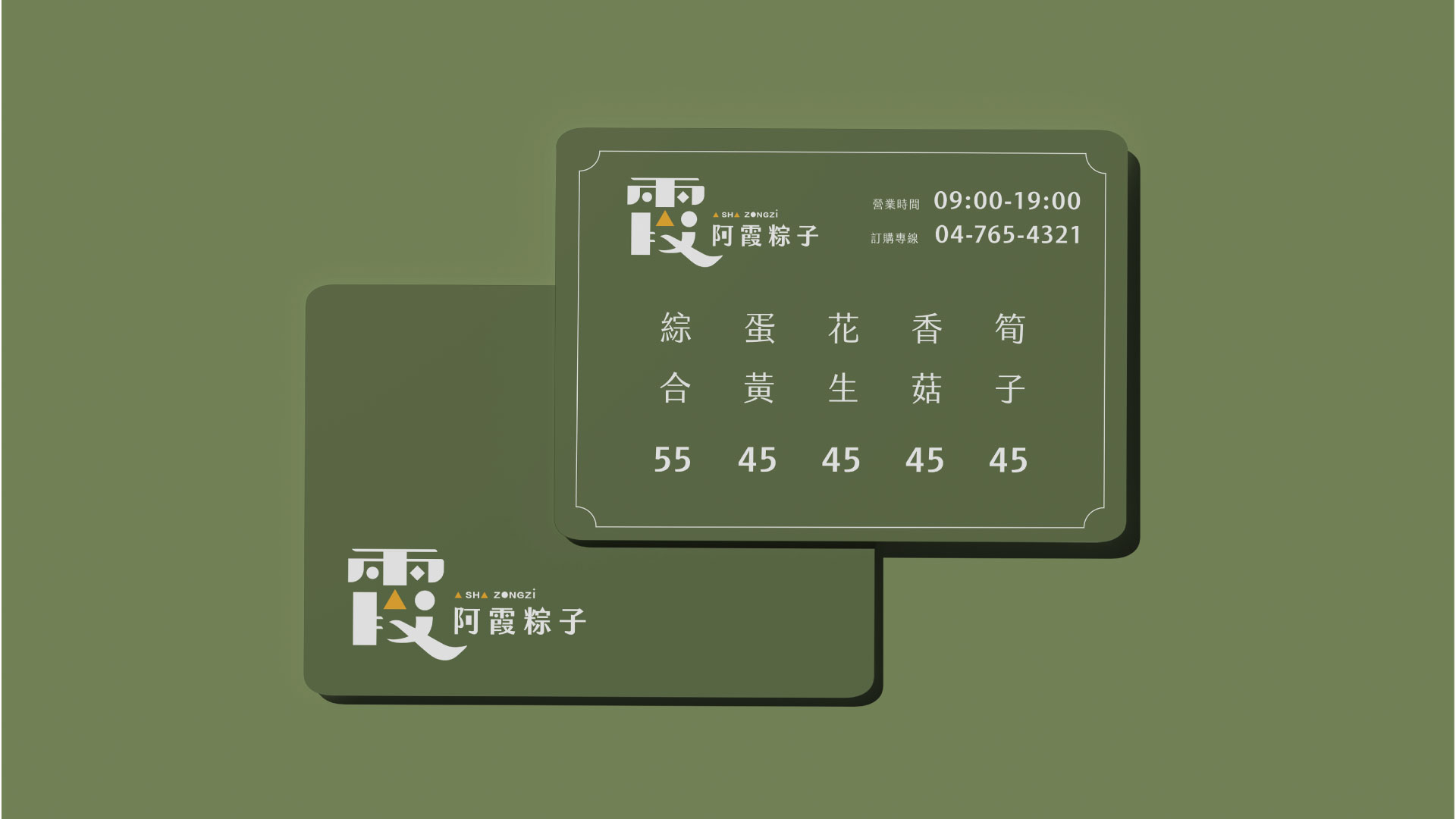
Considering that A-Sha is the keyman of “A Sha Zongzi”, the visual identity focuses on the character “Sha (霞)” and integrates the modern style and the above elements into the identity.
以現代與古樸、粽子造型和非粽子造型去分析市面上的粽子商家,市面上少有識別可以清楚傳達現代感,或充分表達古典與傳承。
因此本專案識別以現代感為風格,試圖凸顯識別的差異化:構成元素主要以常見的粽子原料為出發,將蛋黃、香菇肉燥、糯米、筍子、蝦米與蒸花生濃縮、化身為基本的幾何圖形—三角形、圓形、方形。
考慮阿霞為「阿霞粽子」的靈魂人物,識別以「霞」字為重心,將現代化風格與上述元素融合入識別中。
Color Plan
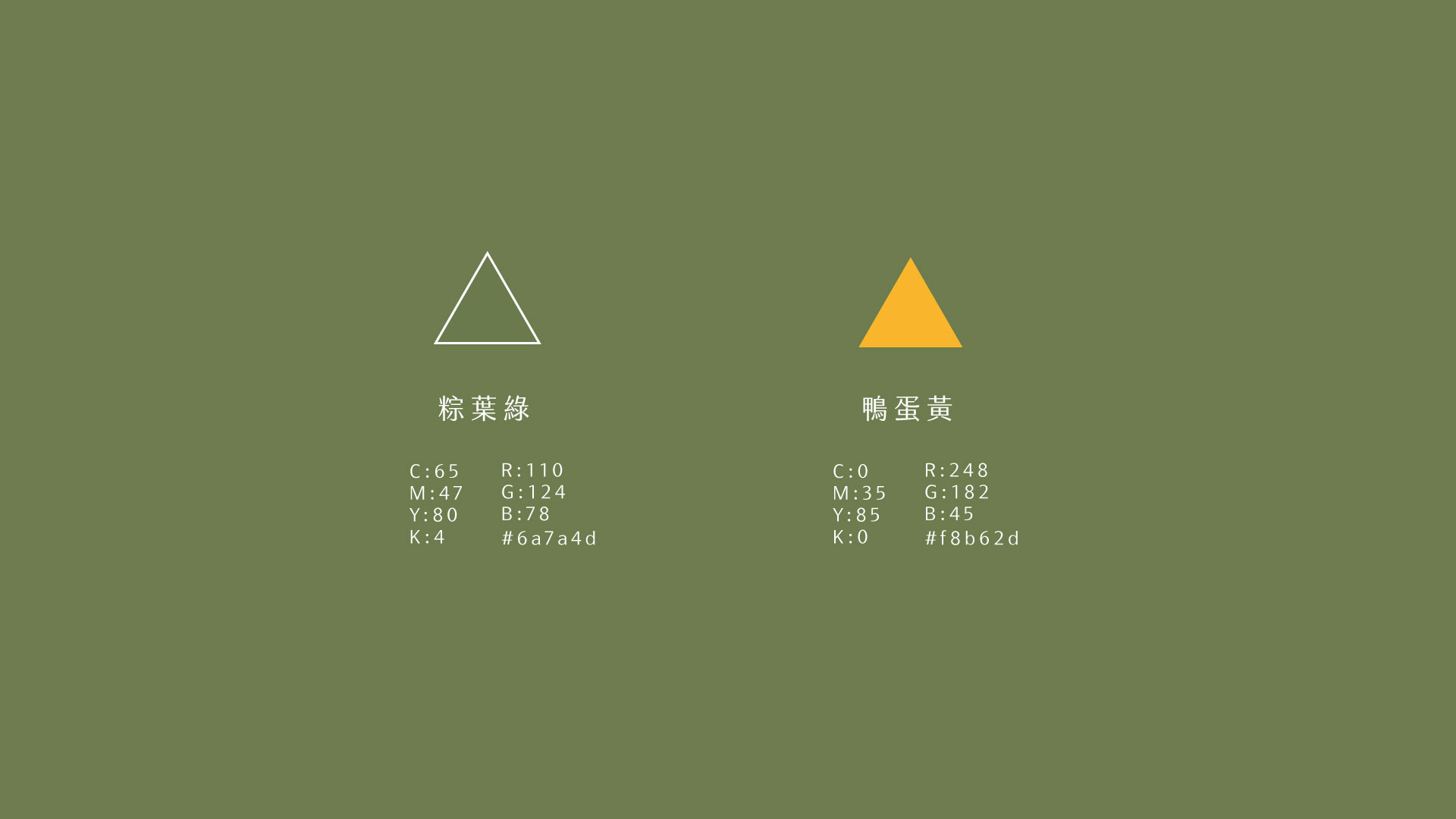
The color plan adopts the highly saturated egg yolk with the calmer green zonzi leaf, giving the overall identity a youthful and energetic atmosphere, breaking away from the current zonzi shop settings in the market.
選色以高飽和的蛋黃黃與較沈穩的粽葉綠搭配,讓整體識別呈現年輕、活力的氛圍,完全跳脫目前市場的粽子商店設定。
Marketing Strategy | Echo Ke
Visual Redesign |Echo Ke
Year | 2022
Note: This is the side-project, not the formal brand design.